B2B Website Design: Is Above the Fold a Myth?
 James Waterhouse
 5 minutes read


Historically, "above the fold" refers to the upper half of a newspaper's front page, where the top news story and photograph are typically located.
In terms of web development, it describes the portion of a webpage that is visible without scrolling. In the early years of the internet, people weren't accustomed to moving past it. It was within these 600 pixels of content nirvana that users would quickly decide whether or not they wanted to stay on a website.
However, this is no longer the case. In 2006, heatmap service provider ClickTale analysed 100,000 pages with scroll bars. On these pages, 76% of readers used the scroll bar to access content below the fold, with 22% scrolling all the way to the bottom. The study concluded that there is little benefit in compacting pages and advised using clear layouts with more visuals and minimal text.

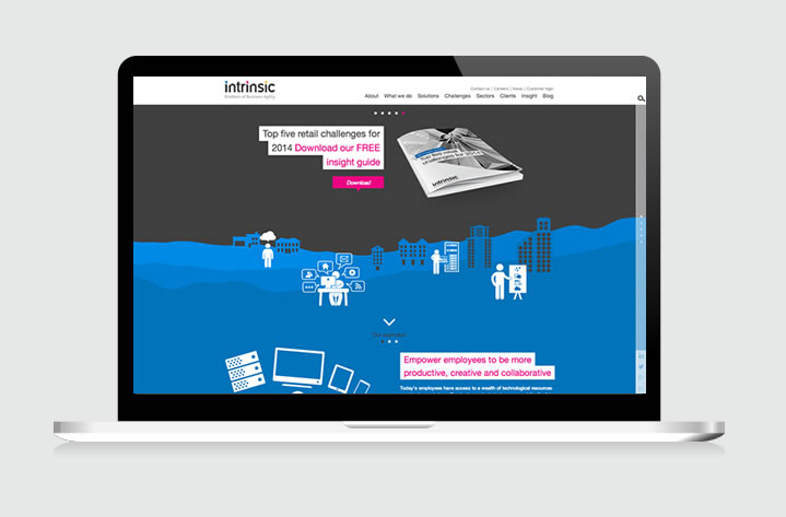
Consider placing your most important content above the fold
Over the last eight years we've become more tech-savvy. The fold isn't what it used to be due to the huge variety of screen sizes and range of devices now in use. However, the issue is still relevant as desktops and laptops aren't going away anytime soon. At the same time, our browsing habits have become ingrained and we require fewer visual cues. We're fully accustomed to the concept of scroll and this was demonstrated when Apple removed the scroll bar from Mac OS X in 2011.
A recent study of popular celebrity news site TMZ found that the links at the bottom of its longest pages were often the most clicked on. This indicated users' willingness to scroll in the pursuit of great content and showed little correlation between scrolling behaviour and screen height if a user is engaged.
Designing specific content to be presented above the fold is becoming less relevant as user behaviour evolves and anyway, the screen size of the devices we use to browse the web now varies greatly. The natural instinct of users on tablets and smartphones is to swipe down. As of March 2014, 25.42% of web pages are being viewed on mobile devices and this number continues to grow.
Visual clues such as down arrows can encourage the user to scroll
B2B website design no longer need to squeeze absolutely every piece of important information into the top of the page. A recent study with the Bristol Airport website revealed that visitors were less likely to scroll down when more information was crammed into this area.
Usability expert Jakob Nielsen’s eye-tracking studies show that although attention is naturally focused above the fold, the majority of people will intuitively scroll, especially if the page is designed to encourage it. Read on for some tried and tested methods to ensure you meet the needs of every user...
Think twice about using horizontal navigation elements, as this could decrease the likelihood of users scrolling vertically. Reduce any space at the bottom of the fold because having a large block of colour may lead some users to believe this is the end of your page.

A well-populated content section in the fold indicates there is more to see
Another option is to completely fill the fold with an image or slideshow. This is quite common, but needs to be done effectively as it may suggest to some users that it represents all the content on the rest of the page.
Ultimately, scrolling down a website page is dependent on the user, the type of website they are visiting and whether or not the content is worth scrolling for. Display the important content above the fold to engage readers (in many cases this content is there for them to interact with in some way), but limit it only to what is required.
From an end user point of view, a visually focused layout is more appealing. A good mix of typography, images and interactive content will ensure people receive the necessary information to stay on a web page. When building your new B2B website, deploy visual clues to encourage scrolling, but don't overload your visitors' senses and risk them navigating away.
