Great Examples of HubSpot CMS website design
HubSpot CMS offers stylish design, a high level of usability, and is easy to work with. Here are some of our favourite examples, and a free checklist.

If you’re looking to redesign your website, then you need a platform that combines great aesthetics, ease of use, and stylish, contemporary design in order to create something truly amazing.
HubSpot CMS is one of these, using easy drag-and-drop templates and modular design to build sites that aren’t just a pretty face, but are geared towards lead generation and engaging with website visitors.
We’ve looked at some of our favourite websites built in HubSpot CMS, and listed a few below. From design, to build, to adding some of HubSpot’s great lead generation features, these sites have been created with inbound in mind, and it shows!
Ideal 
This is a great example, with bold colours, standout CTAs, and the use of real photography to aid the clean design. HubSpot CMS offers the capability of adding CTA buttons with microinteractions, making them more clickable to site visitors, and more visually pleasing.
The dark background on the main image for the website can be a concern for web design companies - sometimes there is a fear that accessibility will be impacted. However, if the text is the right font, size, and placement, there’s no reason to worry, and Ideal’s site is a great example of this!
Chicagoland Skydiving Centre
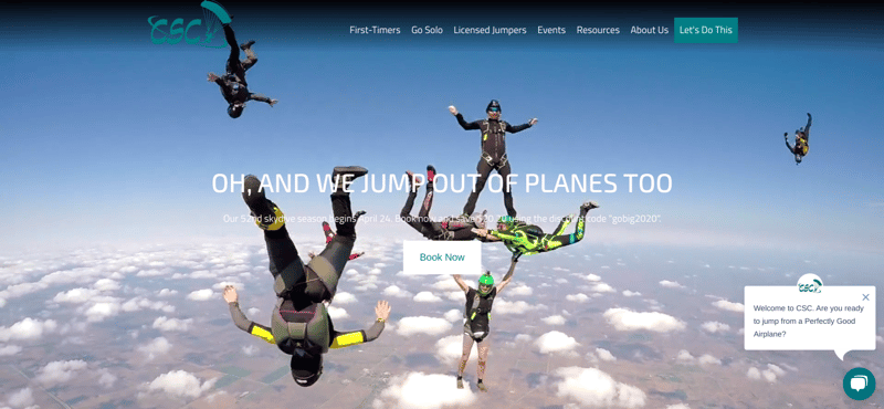
This example of HubSpot CMS design is eye catching and bold, using video to immediately draw attention. Video should be a huge part of your marketing strategy in 2020 to engage with prospects and provide valuable content, and using it in this way on your website means that visitors immediately have to pay attention.
The skydiving centre uses very visual design, using a modular template within the HubSpot CMS to show information in a memorable format. The simple black and blue colour scheme, as well as the sticky menu, means that the website is cohesive and smartly designed with UX in mind.
Hotjar
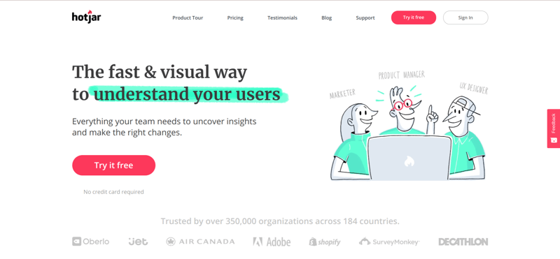
Hotjar is a great tool to check out how pages on your website are performing, using heatmaps to track clicks on each page which you can then use to optimise your website further. It’s a software that thousands of marketers use every day, but we can’t help noticing the clean style of their website!
Built in the HubSpot CMS, this is a great example of whitespace, where you use emptiness in your design to draw attention to the parts that you want to prioritise. With the use of red and green (a bold choice), visitors are immediately driven to the CTAs, as well as the text that sums up the software: “understand your users”. Whitespace has been a big draw to web designers over the last few years, and with HubSpot’s drag and drop page builder, it’s easy to put the information that you need, right where you want it - without sacrificing the aesthetic of your site.
Lloyds British
This is a great example of a ‘hero image’ being used - the photography is relevant and clean, and is slightly darkened to help the text and CTAs stand out. This site also makes use of HubSpot’s chatbot technology, as you can see in the bottom right. Building in HubSpot CMS isn’t just about creating a website that looks good - it also means that you can add features like chatbots to engage with your website visitors. In this example of HubSpot design, the bot pops up and offers an answer to any question the visitor might have, which can impact conversion and help you better understand your prospects.
Qt
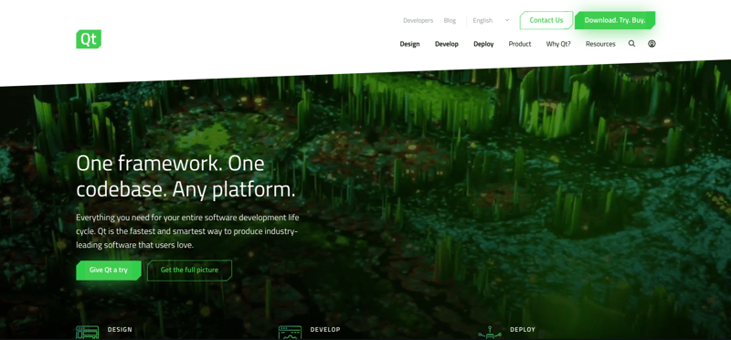
Another example of HubSpot CMS design that we love is this website from Qt. The company has used off-centre design and imbalanced lines to create a dynamic, unusual design that aims to drag the eye downward.
In this example, the CTAs are designed similarly to the background - an unusual choice but a good example of how your CTAs can fit as part of your wider website strategy. Many websites opt to choose a contrasting, standout colour for CTAs, but utilising a colour palette that matches the rest of the site could actually contribute to a cleaner, more stylish design.
Sodexo Filmology
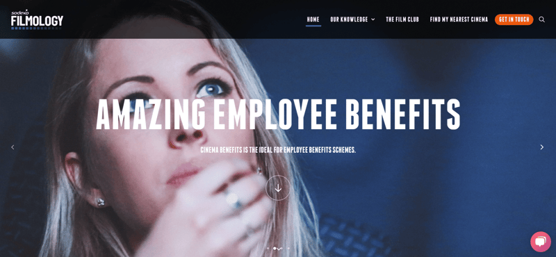
This is another example of using a hero image to grab attention, as well as bold, standout font. Using the HubSpot CMS, Sodexo Filmology has used a CTA in their menu, and also takes advantage of the chatbot to directly engage with their website visitors.
The website also uses anchors to navigate the page - the arrow on the hero image quickly and easily takes visitors to the main part of the page. This is an example of another benefit of the HubSpot CMS - you can make sure that your site visitors get where they need to be at the touch of a button using anchors.
CJ Affiliate
This is another example of a website that features video, using a hero that is ever shifting to keep attention on the text. The CTAs on this site are more subtle - the turquoise against the mostly black and white theme means that they don’t need flashy buttons to look eye catching.
This website also makes use of animation - likely a custom coded module within the HubSpot CMS. Not only does it make the text stand out, but also means that the page is never too cluttered, with plenty of information showing up after a certain amount of time. The ability to build custom templates and modules within the HubSpot CMS means that with the help of a developer, adding these features isn’t too difficult, a level of flexibility that isn’t necessarily possible in many other site builders.
Your website is no longer just a brochure for your business - it’s a fully working member of your team. It’s the first ‘face’ that your prospects see, and therefore it needs to appeal to them both visually and in terms of information. The above examples highlight some of the ways that you can create bold, complex design using the HubSpot CMS, as well as creating a site that is built with lead generation in mind. We exclusively build our B2B websites in HubSpot, and have found that within the CMS, nearly anything is possible in the quest for the perfect website.
If you’re embarking on a new website project, it’s important to consider all aspects of design to make sure that you are attracting visitors and engaging with them successfully. Not sure how to get started? Download our website project checklist to make sure that you're on the right track with HubSpot CMS.
 Alex Martin